5 blank states that delight users and convert

When a new user signs up for your product, many screens start out blank initially.
These are called “blank states”.
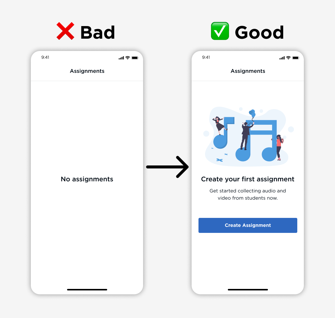
They are golden opportunities to give your product personality and help users finish onboarding. Yet they are often overlooked in UX design.
There are 4 main types of blank states:
- First use (ex. new user onboarding)
- User cleared (ex. completed to do list items)
- Errors (ex. device is offline, can’t do anything)
- No results (ex. no data for search query)
I spent 10 min improving first use onboarding blank states in my product, and conversion rates increased by 3x overnight – no joke.
Here are 5 great blank state examples that delight users and boost metrics:
1. Call to action with illustration
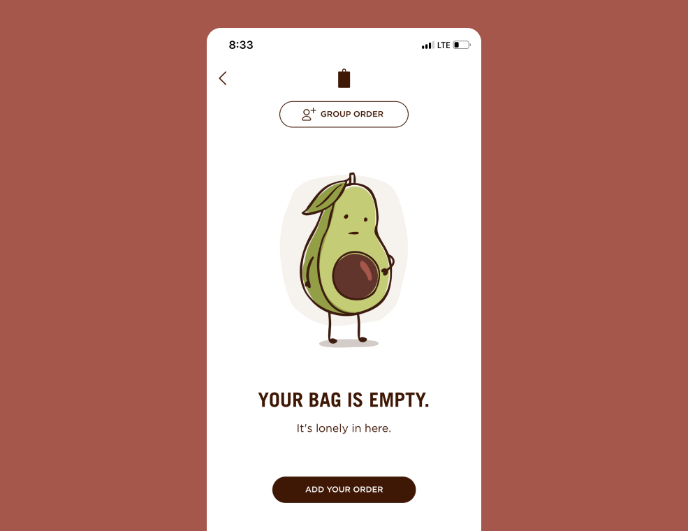
This is the fastest and easiest way to brighten your product’s experience. Display a nice illustration that's in line with your brand with a strong call to action button:
Chipotle shows an adorable avocado with an empty belly. It makes you want to tap "Add Your Order" right away! And if you know me, you know I love my Chipotle.
2. Demo with walkthrough data
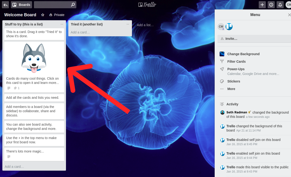
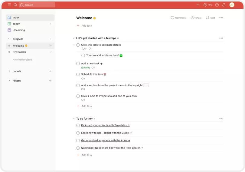
Some products get creative and use the product itself as a guided walkthrough.
- Trello presents a Welcome Board with cards that guide you.
- Todoist presents a Welcome to do list with tasks to get started.
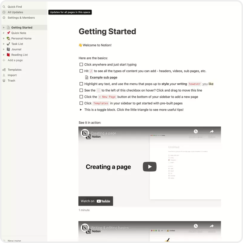
- Notion presents a Getting Started page to learn what you can do.
These guided walkthroughs are amazing because you are physically using the product while learning everything it can do. They got you learning without knowing you were learning! Classic teacher trick.
(My wife is a teacher. And although she'll never read this, I know she would appreciate that.)
3. Dashboard with sample data
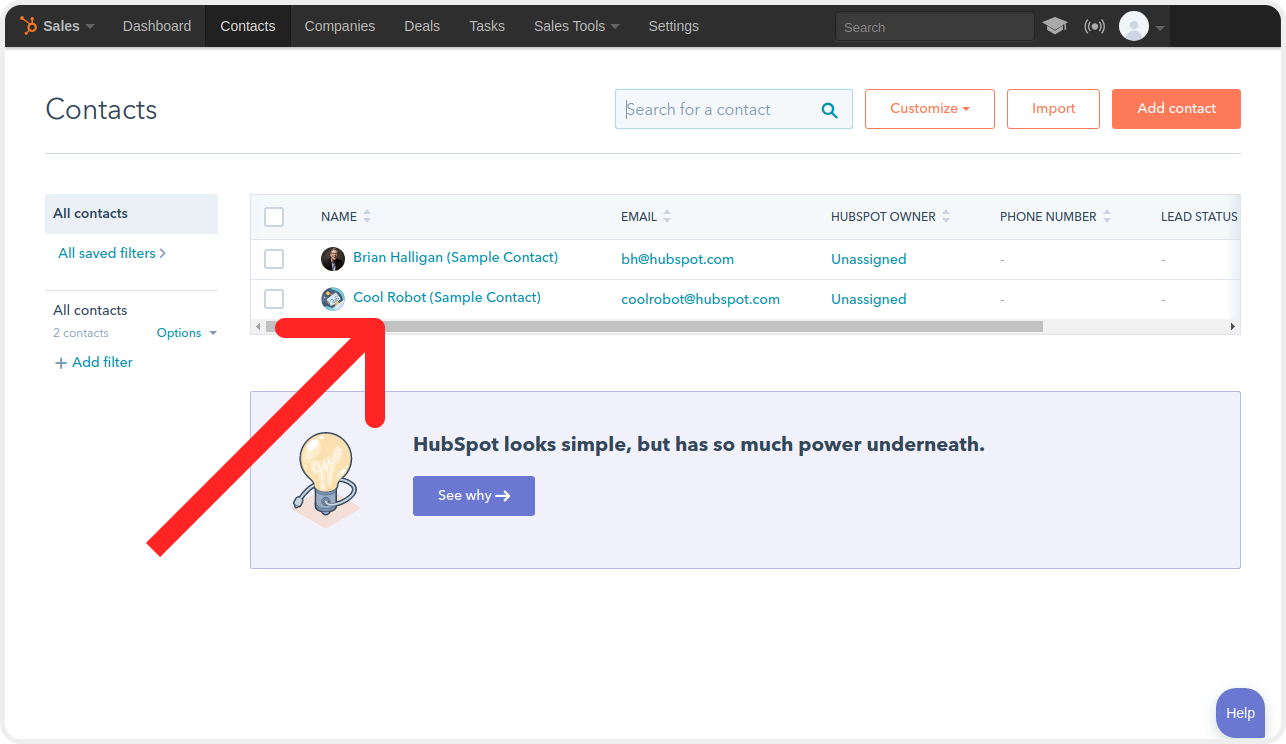
Instead of making me add data right away, show me how you help me with sample data.
- Hubspot added 2 sample contacts to show you interactions in their CRM.
- Mixpanel displays a sample dashboard that shows off their helpful charts.
These products show the value of the fully integrated product right away. This motivates users to complete onboarding so they can use their own data.

4. Tutorial or checklist
I usually discourage tutorials because users are impatient. They want to try out the product – not click through all your step by step windows.
However, some products integrate tutorials so smoothly that it's perfect:
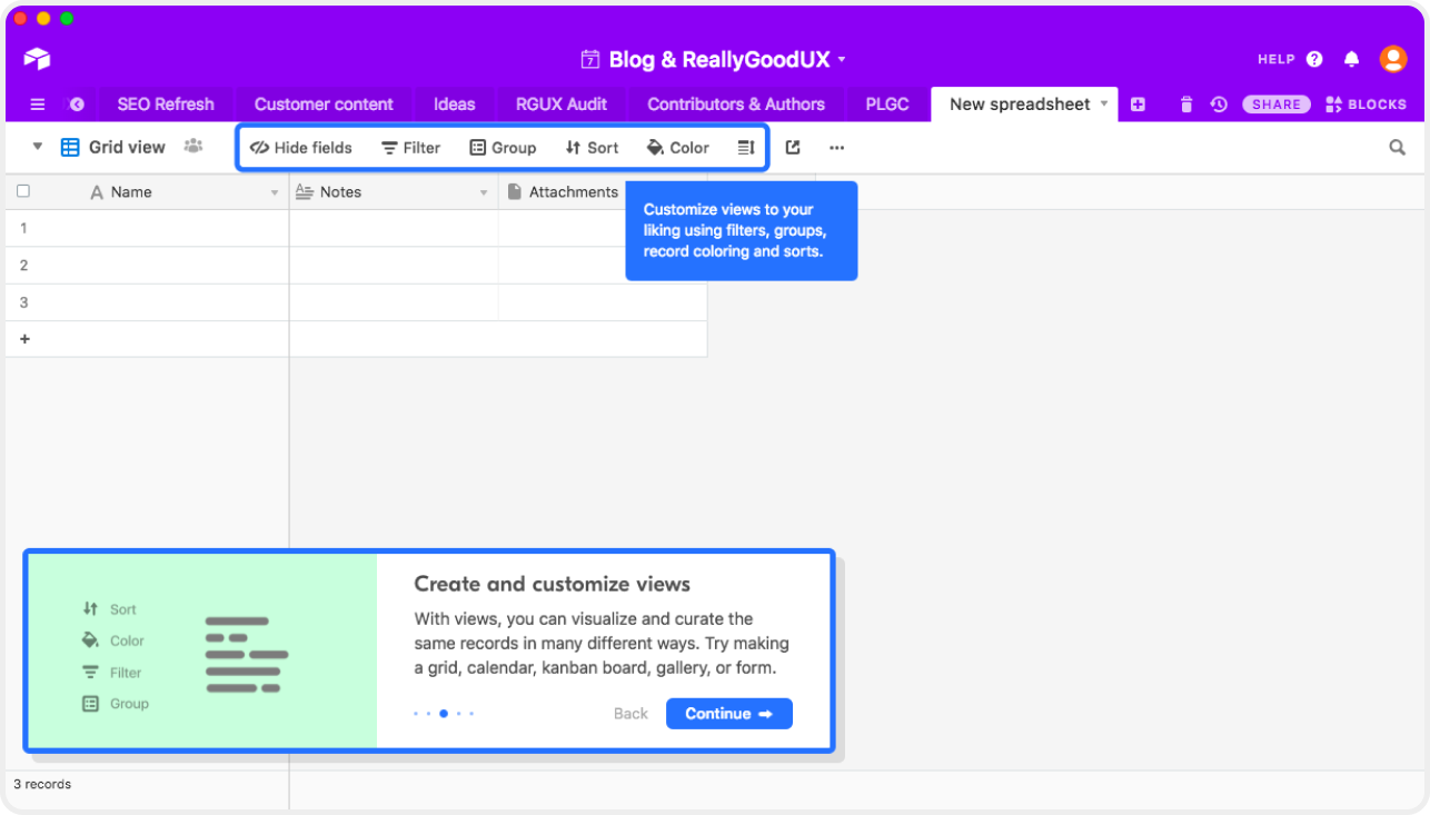
- Airtable displays contextual windows when you create your first base.
- Hotjar blurs the background to emphasize completing installation first.
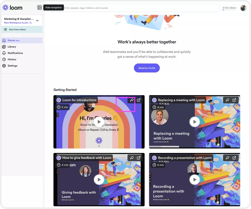
- Loom has actual Getting Started videos that are, you guessed it, Loom videos.

5. Empty dashboard
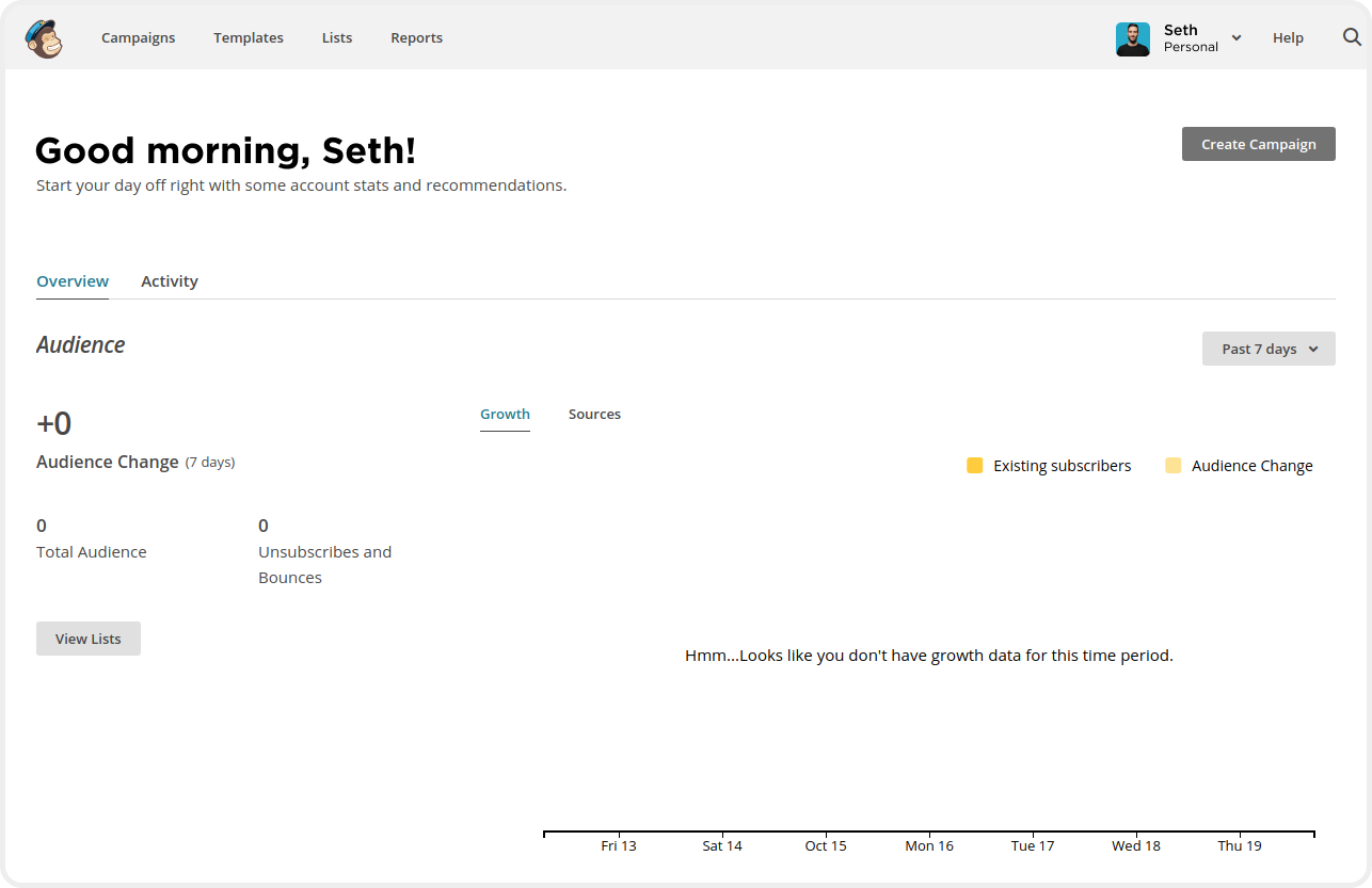
Mailchimp pulled a 180 on everyone else and displays an empty dashboard.
It's not a completely blank screen though. You know exactly what will change when you start adding contacts and creating campaigns. This encourages users to upload their content so they can start seeing pretty things happen on the dashboard.
BONUS - My personal favorites
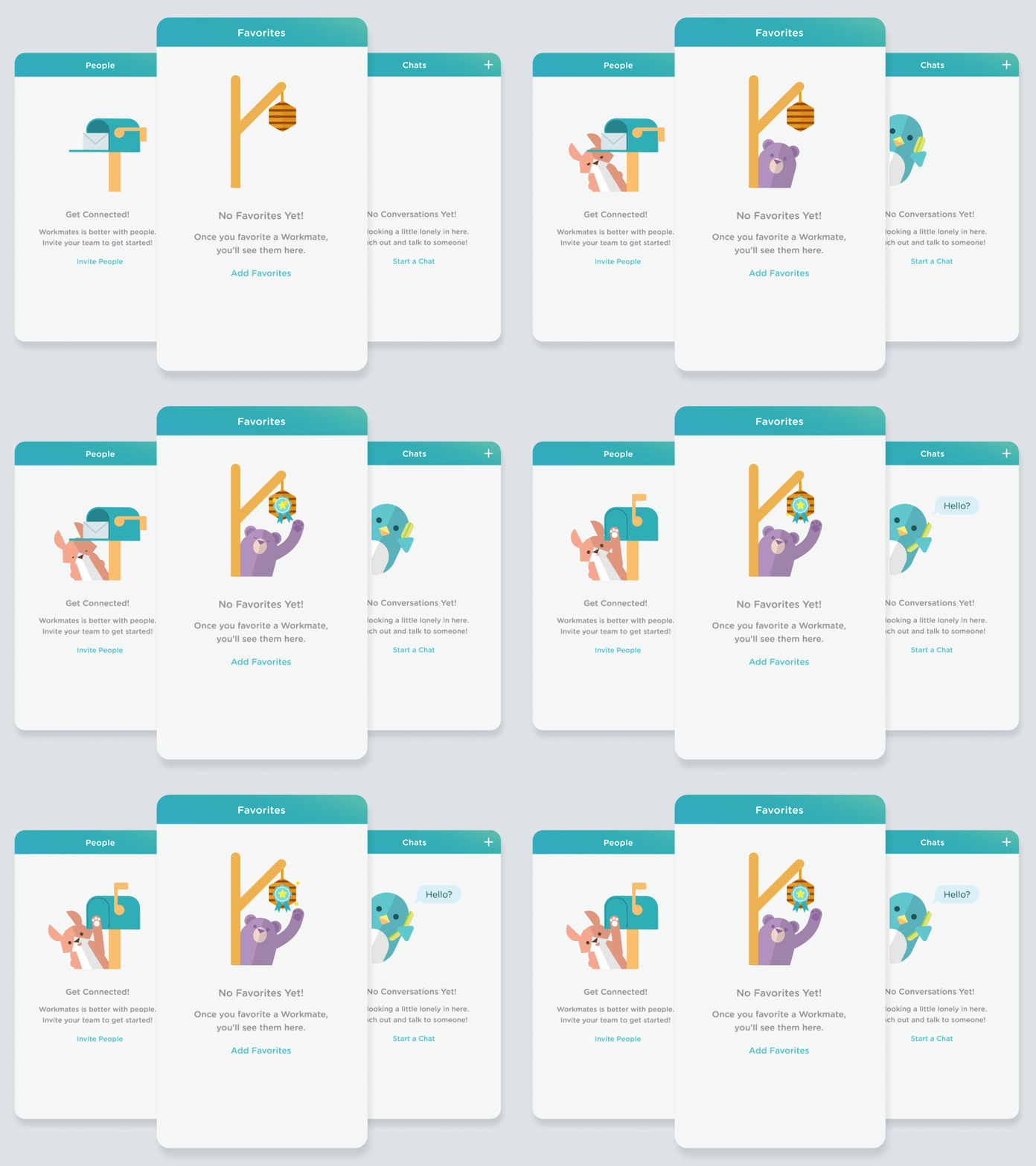
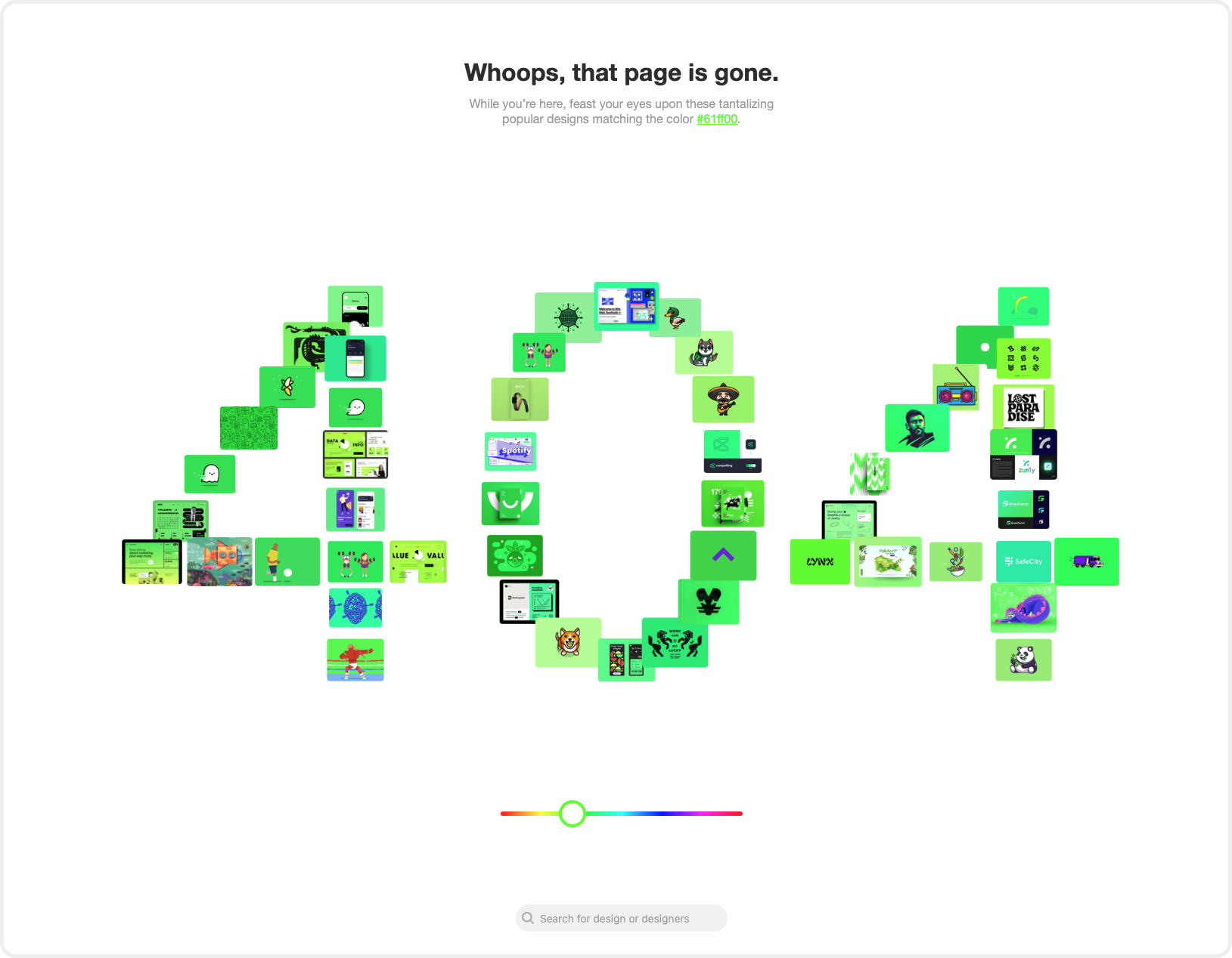
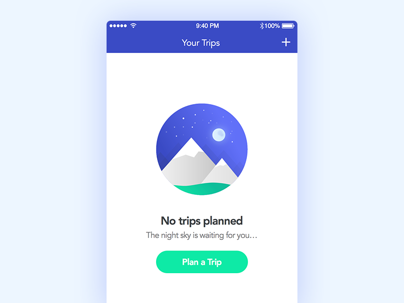
These are just too creative and adorable not to share.
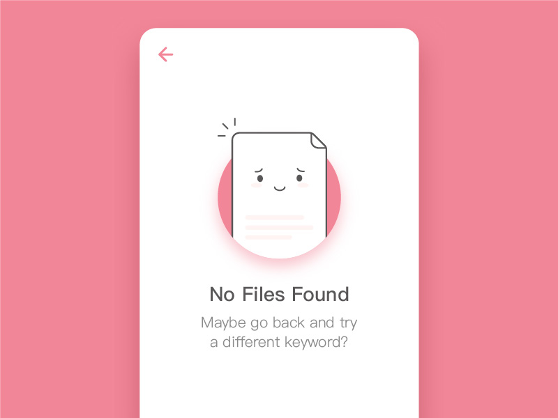
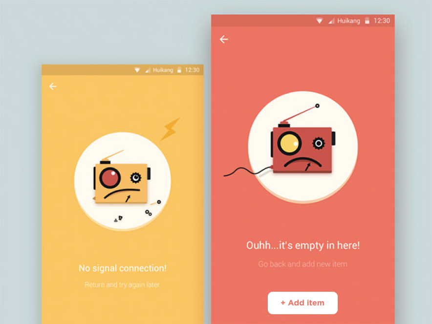
Improving your product's blank states will delight users and increase conversion metrics across the board. If you found this helpful, follow me on LinkedIn for more product and startup tips.
Subscribe for more.
Startup and product lessons delivered right to your inbox.
Join 3,064 other followers and get notifications for new posts.


